Elevate Your Brand with Calm Design: A Blueprint for Success
In today’s fast-paced digital age, where attention spans are shrinking and advertising competition keeps growing, the importance of design in capturing and retaining user attention cannot be overstated. One design trend that has gained significant traction for its positive impact on user experience is "Calm Design." This innovative approach to design goes beyond aesthetics, focusing on creating tranquil and seamless user interfaces. In this blog post, we'll explore the myriad benefits of calm design and why it's a game-changer for businesses looking to stand out in the digital landscape.
Enhanced User Experience: Calm design places user experience at its core, ensuring that every element contributes to a harmonious and stress-free interaction. By incorporating soothing color palettes, clean layouts, and uncluttered interfaces, businesses can create an environment that encourages users to engage with their brand without feeling overwhelmed. This enhanced user experience can lead to increased customer satisfaction and loyalty.
Increased Accessibility: Calm design prioritizes accessibility, making it easier for users of all abilities to navigate and interact with a website or application. Clear typography, well-defined navigation, and thoughtful use of whitespace contribute to an inclusive design that accommodates diverse user needs. This not only broadens your potential audience but also aligns with ethical design practices.
Boosted Conversions: A calm and user-friendly design can significantly impact conversion rates. When users feel at ease while browsing a website or using an app, they are more likely to explore and take desired actions, such as making a purchase or filling out a form. By minimizing distractions and focusing on a seamless user journey, calm design creates an environment conducive to conversions.
Establishing Trust and Credibility: Calm design exudes professionalism and attention to detail, helping to establish trust and credibility with users. A well-designed and thoughtfully organized website or application reflects positively on your brand, making users more likely to trust your products or services. Trust is a key factor in building long-lasting relationships with customers.
Reduced User Frustration: Complex and cluttered designs can lead to user frustration and abandonment. Calm design simplifies the user experience, minimizing the risk of confusion or irritation. By providing a clear path for users to follow and presenting information in a digestible manner, businesses can reduce bounce rates and keep users engaged.
Differentiation in a Crowded Market: In a crowded marketplace, standing out is crucial for success. Calm design sets your brand apart by offering a refreshing alternative to the noise and visual clutter that characterize many digital platforms. This differentiation can leave a lasting impression on users and make your brand more memorable.
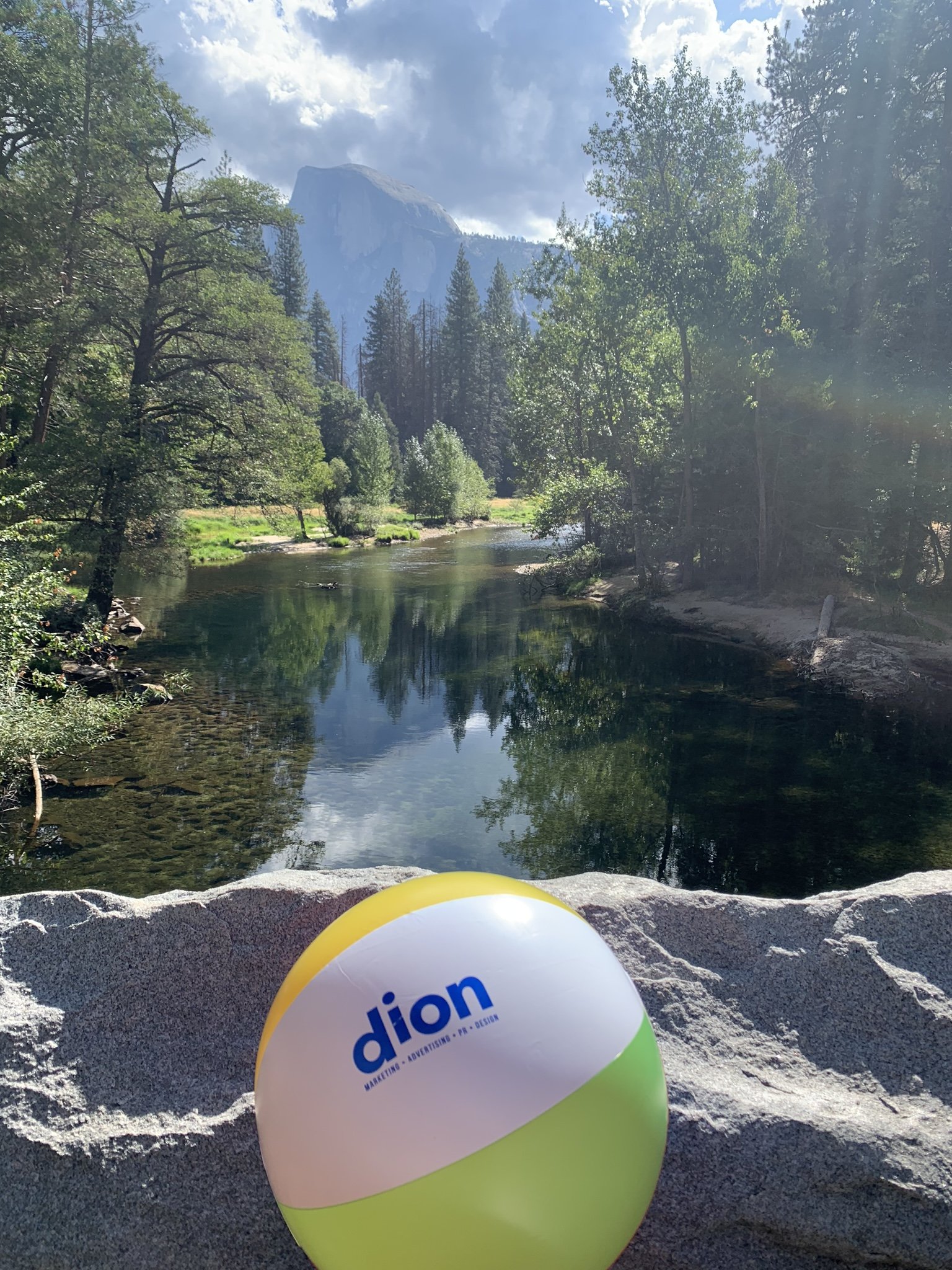
Imagine a serene workspace featuring a well-designed digital device displaying a website or app interface. The screen showcases a calming landscape, perhaps a tranquil beach scene or a lush forest. Surrounding the device are elements like a minimalist desk, a comfortable chair, and a cup of herbal tea. The color palette consists of soothing blues and greens, with ample whitespace creating a sense of openness.
Here are some elements to consider for a calm design project:
Elements to Include:
Color Palette:
Choose soft and muted colors like pastel blues, greens, or earthy tones.
Consider a monochromatic color scheme for a harmonious look.
Whitespace:
Use ample whitespace to create a clean and uncluttered appearance.
Ensure a balanced distribution of space for a sense of tranquility.
Typography:
Opt for clean and legible fonts with a minimalist style.
Consider using a sans-serif font for a modern and soothing effect.
Imagery:
Incorporate simple and cohesive imagery, such as nature-inspired elements.
Utilize high-quality, calming visuals like water, leaves, or abstract patterns.
Layout:
Keep the layout simple and well-organized.
Use a grid system for a structured and balanced composition.
Details:
Add subtle details like smooth curves or rounded edges for a softer feel.
Include elements that suggest comfort, such as a cozy chair or a cup of tea.
Lighting:
Use soft, diffused lighting to create a gentle and inviting ambiance.
Consider the interplay of light and shadow for depth and warmth.
While calm design is challenging for our clients whose businesses sell fun and excitement, we are adapting to a calm approach by focusing on some of the attributes of visiting a theme park or waterpark, such as creating happy memories or escaping from the hustle-bustle of everyday life. A call-to-action has always been more of an in-your-face strategy when selling items and experiences online, but consumers are attracted to a visually pleasing and user-friendly environment that encourages engagement without overwhelming or distracting the audience.
As businesses navigate the ever-evolving landscape of digital marketing, adopting a calm design philosophy is not just a trend but a strategic choice for success. By prioritizing user experience, accessibility, and trust, businesses can create a digital presence that resonates with their audience, fosters positive interactions, and ultimately drives growth. Embrace calm design, and watch your brand elevate to new heights in the digital realm.
If you are looking for help elevating your brand whether or not using calm design as a fit for your advertising strategy, Dion Marketing can help position you. We’d love to talk to you! Give us a call at 904-249-9784 or fill out our contact form to get in touch!

